TRUCKATO
An app to locate nearby food trucks and place an order for pickup.
Role:
UI UX Designer
Project Duration:
6 weeks
PROBLEM
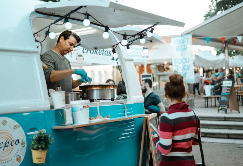
“Food trucks in Bengaluru down from 48 in 2020 to just 10 now.”
– Deccan Herald, Dec 01 2021
Food truck owners are winding up their food truck businesses as they are going under loss due to lack of footfall.
CHALLENGE
While I was searching to understand more about the problem, I found out that food trucks in metropolitan cities like Bengaluru do not have much online visibility and are not well known to people. This led to my question:
How might we help popularize the food truck culture?
PROPOSED SOLUTION
Hypothesis
A tool that determines the accurate location of food trucks in the city, provides quick information about them and has an option to place an order for pickup will help people gain more knowledge about food trucks, save their time and also popularize food truck culture.
Why?
A tool that shows the live location of food trucks in the city, provides quick information about them and has an option to place an order for pickup will help people gain more knowledge about food trucks, save their time and also popularize food truck culture.
The food trucks serve in fixed/flexible locations and irregular serving hours. Few people try to remember their serving hours and location and visit them occasionally. However most of them find it difficult to remember the details. Also, many working adults do not prefer placing an order at the food truck and waiting in the queue after a busy day.
PRODUCT PREVIEW
Click the expand button on the top right corner to try the prototype in full screen!
MY DESIGN PROCESS

RESEARCH
User Research
SUMMARY
- I conducted interviews with few of my friends and relatives to better understand the users I’m designing for and their needs.
- I asked them open ended questions like: What do you know about food trucks in Bengaluru? Tell me about your day to day activities? Have you visited any food truck recently? How do you look for food trucks?
- This user group confirmed initial assumptions about food truck customers that the users weren’t aware of the food truck location and at what time they would be open.
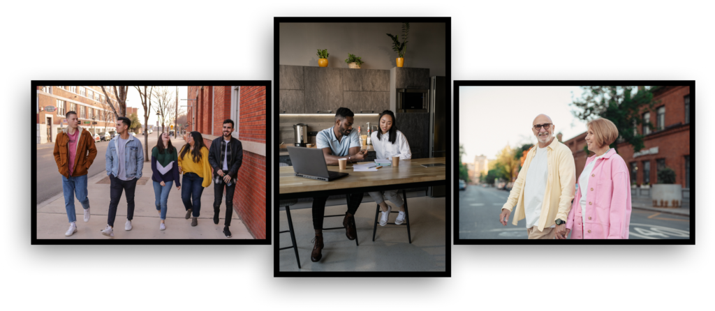
A primary user group identified through research was millennials, working adults and Senior Citizens who would like to have quick and healthy food on the go.
PAIN POINTS

Platform
Users feel that there are no proper online platforms for food trucks in their city.

Serving Hours
Users do not have knowledge of serving hours of the food trucks.

Location
Users are unaware of the location of the food trucks at a give time of the day.
Users feel that there are no proper online platforms for food trucks in their city.
Users do not have knowledge of serving hours of the food trucks.
Users are unaware of the location of the food trucks at a give time of the day.
Competitive Analysis
An audit of a few indirect competitor’s products provided direction on gaps and opportunities to address with our app. I could not find any direct competitors who were offering the same services and who were focused on the same audience.

GAPS
- The competition did not provide a daily updated menu.
- The competition had no option to place an order through app.
Persona Development
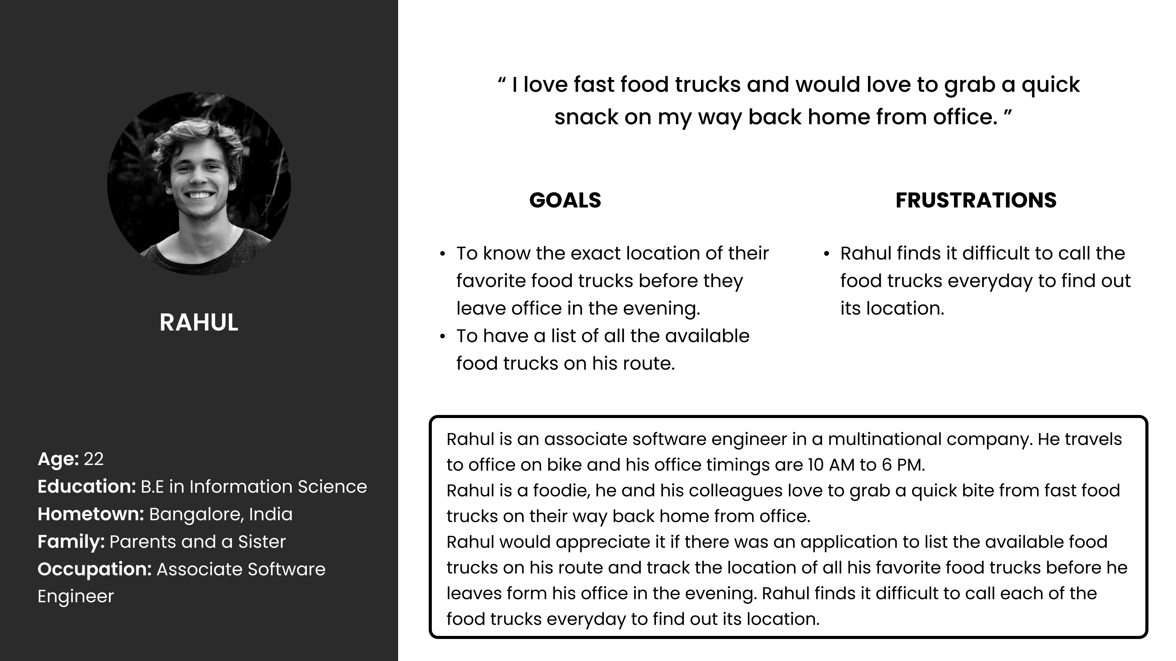
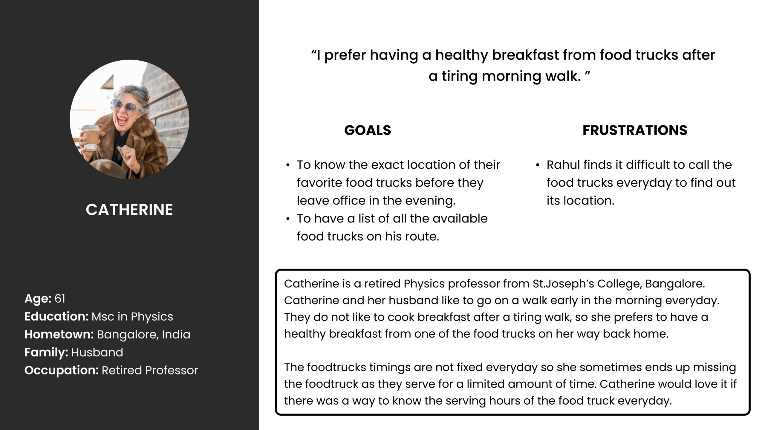
Based on the research insights, I developed a primary persona demonstrating our target users, especially their goals and pain points.
INFORMATION ARCHITECTURE
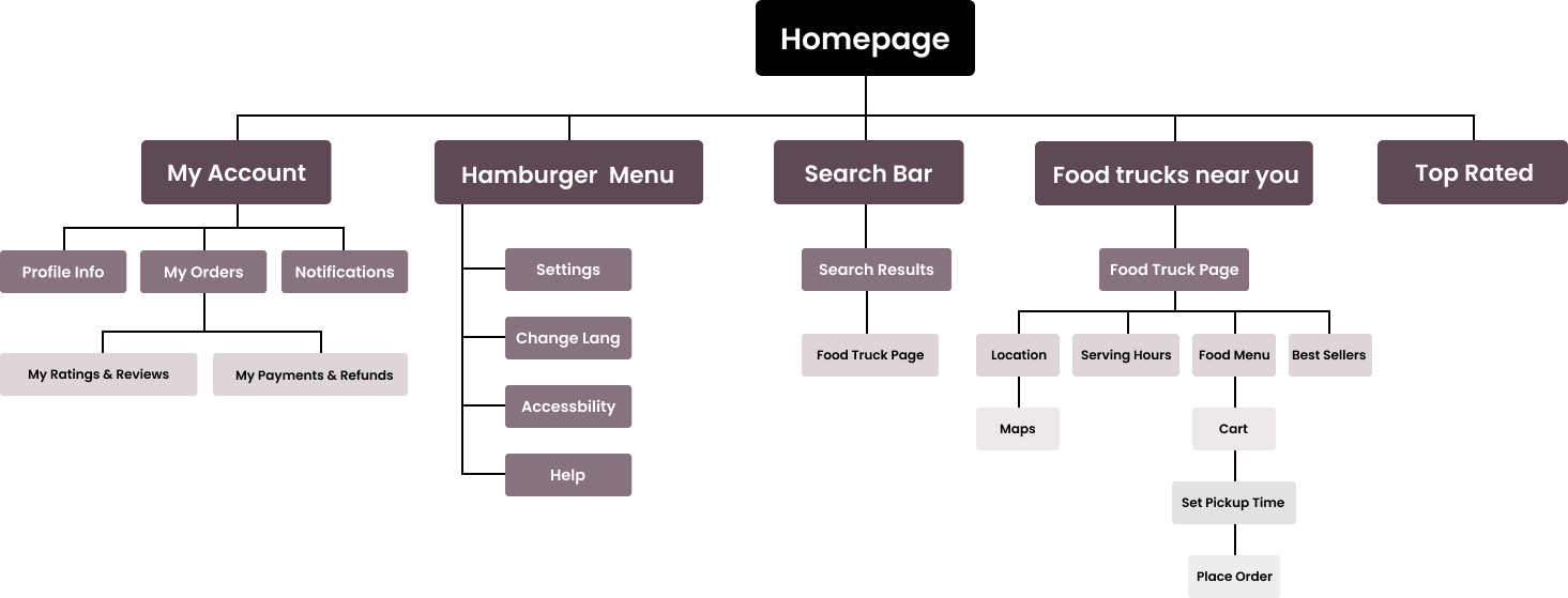
I proceeded to create information architecture before starting the designing process to have a clear idea to structure the product and follow the pattern to create flows.
STARTING THE DESIGN
Paper Wireframes
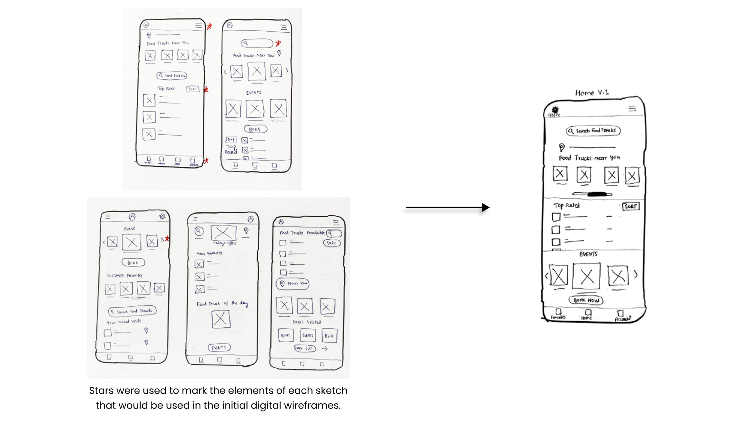
Taking the time to draft iterations of each screen of the app on paper ensured that the elements that made it to digital wireframes would be well-suited to address user pain points.
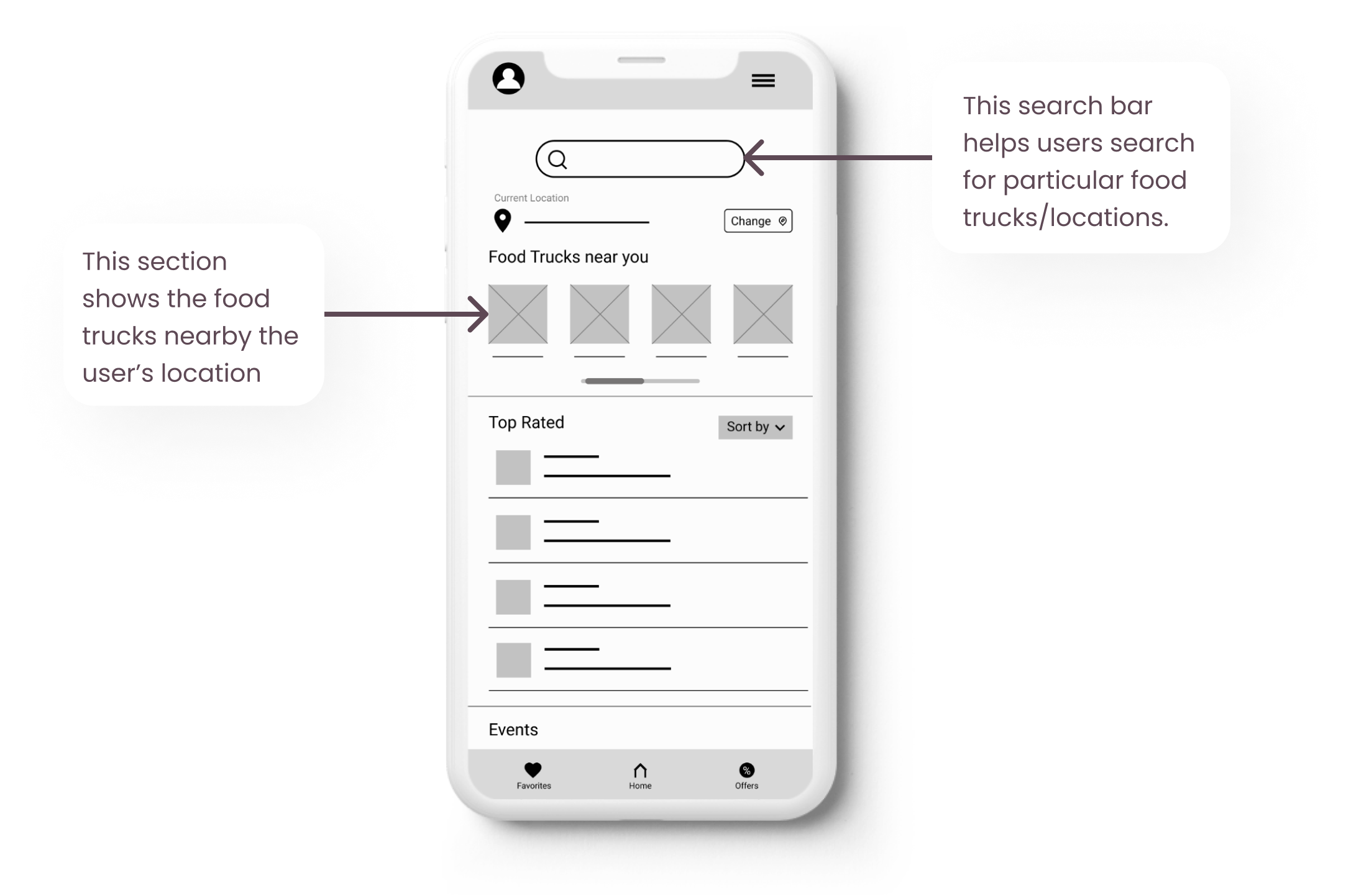
For the home screen, I prioritized a quick and easy process to help users search/locate nearby food trucks.
Digital Wireframes
As the initial design phase continued, I made sure to base screen designs on feedback and findings from the user research.
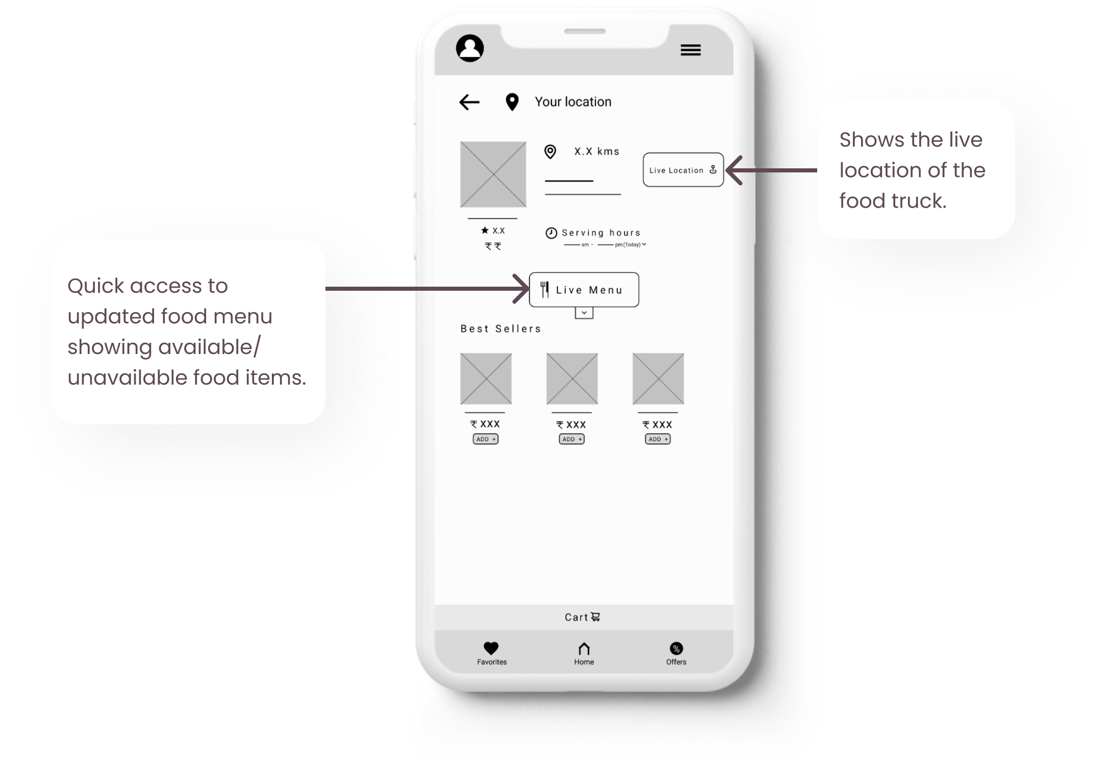
I integrated the important details of the food truck into a single screen so that the users can have a quick access of the necessary information.
Low-Fidelity Prototype
Using the completed set of digital wireframes, I created a low-fidelity prototype. The primary user flow I connected was checking live location of the food trucks near the user and placing an order for pickup so that the prototype could be used in a usability study.
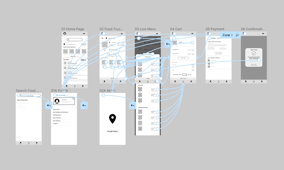
Click below to view Truckato’s Low-Fidelity Prototype
Usability Testing
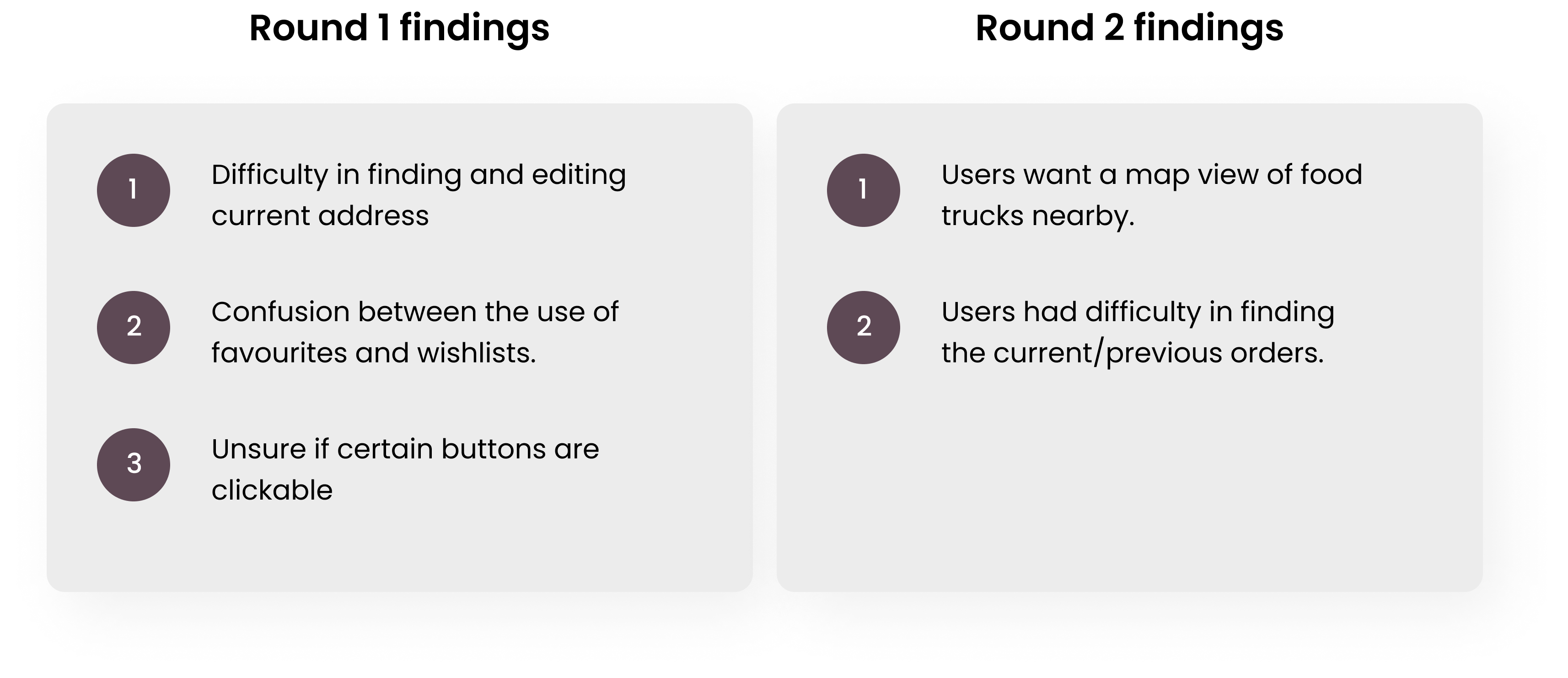
I conducted two rounds of usability studies. Findings from the first study helped guide the designs from wireframes to mockups. The second study used a high-fidelity prototype and revealed what aspects of the mockups needed refining.
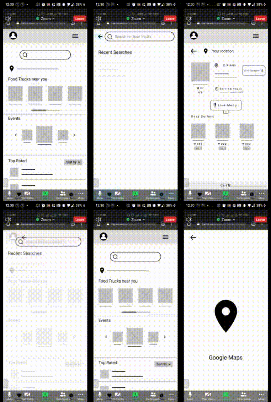
User trying Prompt 1
Interview questions and prompts
- Prompt 1: Search for your favourite food truck and check its live location.
- Prompt 1 follow-up: How easy or difficult was this task to complete? Is there anything you would change about the process of locating a food truck?
- Prompt 2: Select a food truck and check for its serving hours.
- Prompt 3: Select food items from the live menu, set pick-up time and place an order by completing the payment process.
- Prompt 3 follow-up: How easy or difficult was this task to complete? Is there anything you would change?
- Prompt 4: From the homepage, figure out where you would go to edit your current address.
- Prompt 5: How did you feel about this food truck app overall? What did you like and dislike about it?
FINDINGS
REFINING THE DESIGN
Mockups
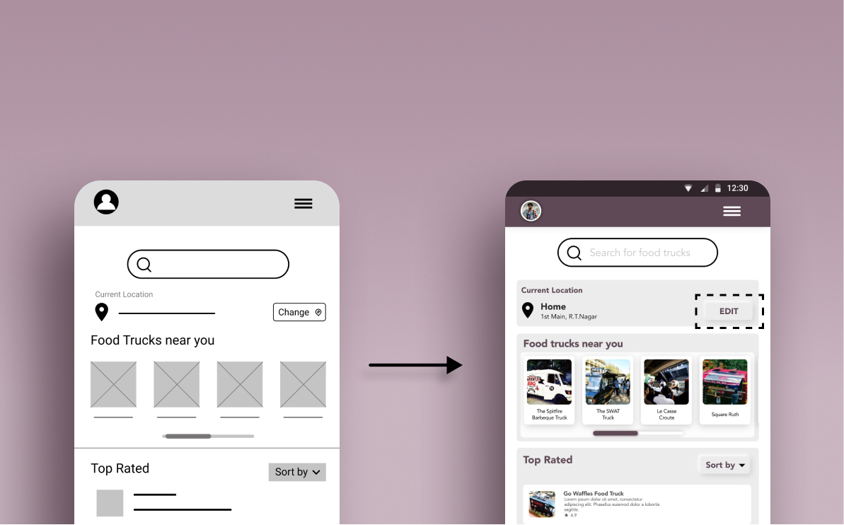
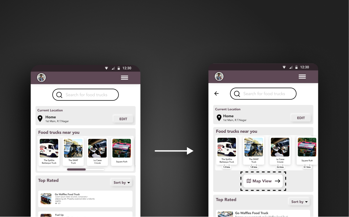
Early designs allowed for some customization, but after the usability studies, I revised the design to add the EDIT button under the common region of current location so users can easily access and edit their current location.
The second usability study revealed confusion in accessing current/previous orders. So, I moved ‘My Orders’ from ‘My Account’ Page to the ‘Hamburger Menu’ where most users expected it to be and renamed it as ‘Your Orders.’
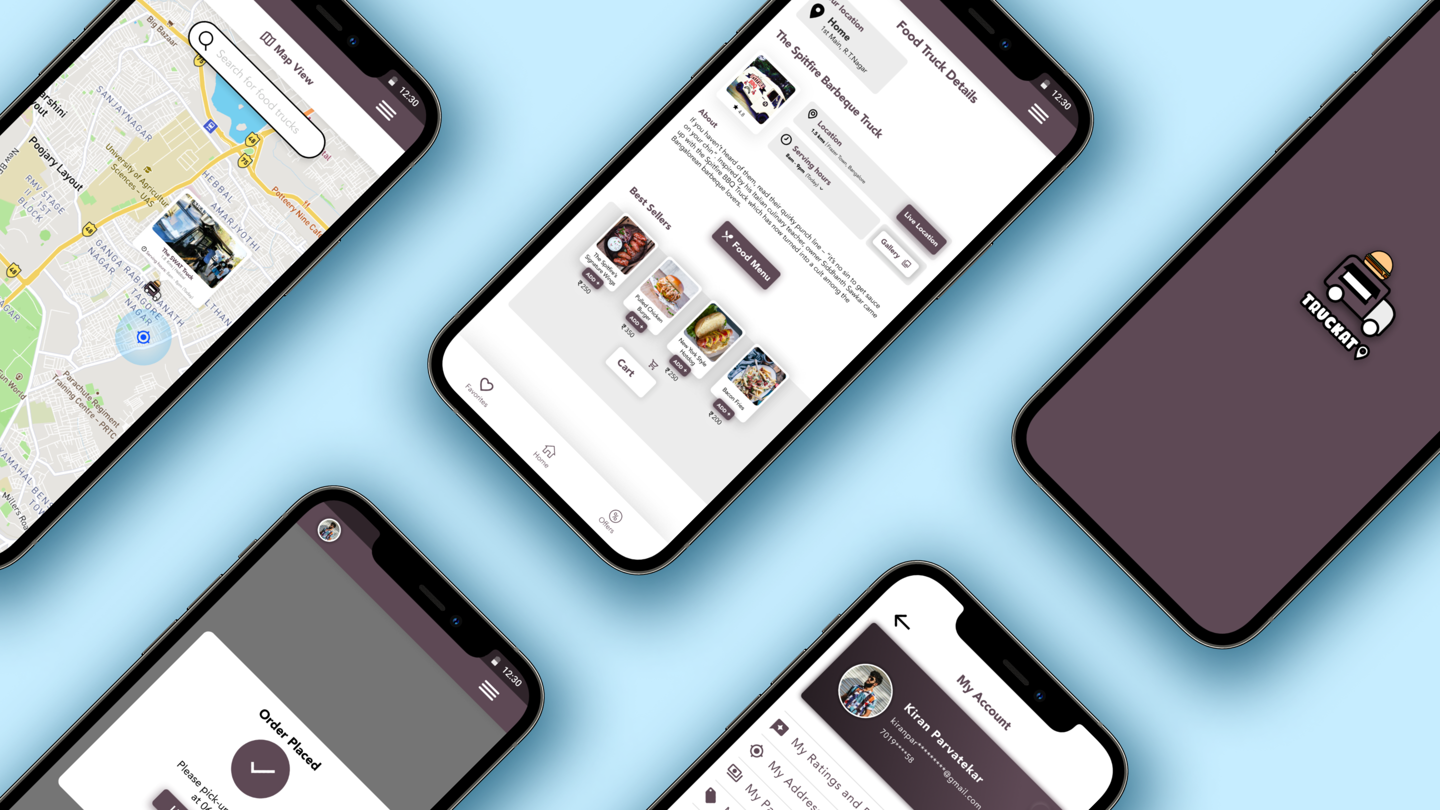
I also added a Map View page for users to see all the food trucks around their location.
High-Fidelity Prototype
The final high-fidelity prototype presented cleaner user flows for searching food truck nearby, checking live location and placing an order for pickup by setting the pickup time.
Click the expand button on the top right corner to try the prototype in full screen!
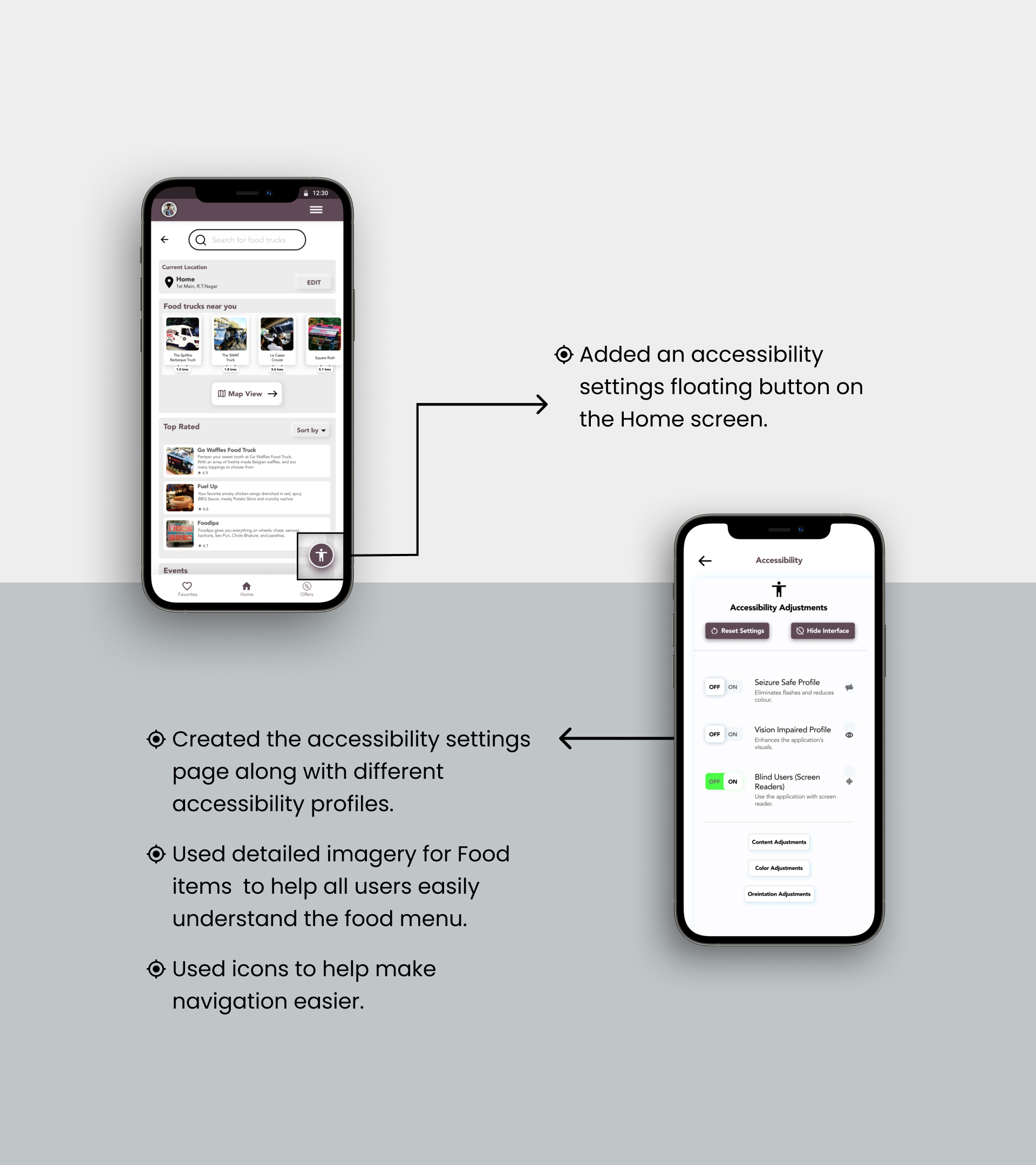
Accessability Considerations
FUTURE ROADMAP
Takeaways

Impact
The intuitive design of the app would help the users discover more about food trucks in the city and popularize the food truck culture by spreading the word.
One quote from peer feedback:
“The app is intuitive and these pictures make me want to visit a food truck now. I would definitely recommend this app to my friends.”

What I learned
While designing the Truckato-Food Truck App, I learned that user feedback and iteration is a key factor for a design to be successful. For every usability study round there was always something to learn.
Next Steps

Conduct another round of usability studies to validate whether the pain points users experienced have been effectively addressed.

Conduct more user research to determine any new areas of need.