A responsive website to find and view cooking tutorials.
Role:
UX designer leading Cooktute’s website design.
Project Duration:
Feb 2022 – April 2022
PROBLEM STATEMENT
People staying independently at metropolitan cities and working from home do not have sufficient cooking knowledge/skills to cook meals for themselves. They depend on food delivery apps and restaurants for their meals, resulting in an increase in expense and consumption of unhealthy food.
BACKGROUND
Hypothesis
A one-stop website that allows people to find and view cooking tutorials will help encourage people living independently to learn cooking and cook healthy food for themselves.
Why?
A one-stop website that allows people to find and view cooking tutorials will help encourage people living independently to learn cooking and cook healthy food for themselves.
With a hybrid working model being adopted everywhere in the world, people are working from home 3 out of 5 days a week. Most people staying independently order in most of their meals. However they are not happy in consuming restaurant food everyday as it is unhealthy and high on expense.
THE PRODUCT
Cooktute is a responsive website for finding and viewing cooking tutorials. Cooktute aims at providing a one-stop solution to learn cooking at home while encouraging healthy food habits. Cooktute targets working officials who are working from home and would like to be able to learn/improve cooking with interactive and easy tutorials.
UNDERSTANDING THE USER
User Research
SUMMARY
I conducted interviews and created empathy maps to understand the users I’m designing for and their needs.
A primary user group identified through research was working adults who would like to have an explicit website to learn/improve their cooking skills.
This user group confirmed initial assumptions about Cooktute customers that there is no proper one-stop solution to learn cooking online.
Other user problems included absence of nutritional info on video tutorials of dishes, no knowledge/information behind certain preparation steps and inadequate preparation instructions.
PAIN POINTS
By ordering food from restaurants users end up spending a lot of money on their meals.
Users are fed up of repetitive consumption restaurant food.
Regularly ordering in and having restaurant food is unhealthy to the body.
By ordering food from restaurants users end up spending a lot of money on their meals.
Users are fed up of repetitive consumption restaurant food.
Regularly ordering in and having restaurant food is unhealthy to the body.
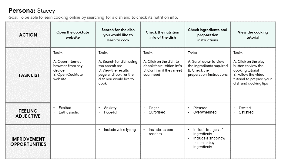
Persona
Stacey is a busy working adult primarily working from home who needs an online platform to learn cooking so that she can cook for herself to eat healthy and cut back on the expense of ordering food from eateries.
User Journey Map
I created a user journey map of Stacey’s experience using the site to help identify possible pain points and improvement opportunities.
STARTING THE DESIGN
Site Map
I created a sitemap of a website to find and view cooking tutorials considering the pain points of the users.
Paper Wireframes
Taking the time to draft iterations of each page of the website on paper ensured that the elements that made it to digital wireframes would be well-suited to address user pain points.
For the home page, I prioritized a quick and easy way for the users to find and view cooking tutorials.
Paper Wireframe - Screen Size Variation
Because Cooktute’s users access the site on a variety of different devices, I started to work on designs for additional screen sizes to make sure the site would be fully responsive.
Digital Wireframes
Moving from paper to digital wireframes made it easy to understand how the design could help address user pain points and improve the user experience.
Prioritizing useful button locations and visual element placement on the home page was a key part of my strategy.
Digital Wireframe - Screen Size Variation
Low-Fidelity Prototype
To create a low-fidelity prototype, I connected all of the screens involved in the primary user flow of adding an item to the cart and checking out.
At this point, I had received feedback on my designs from members of my team about things like placement of buttons and page organization. I made sure to listen to their feedback, and I implemented several suggestions in places that addressed user pain points.
Click below to view Cooktute’s Low-Fidelity Prototype
These were the main findings uncovered by the usability study:
Users had slight confusion while navigating to view the cooking tutorial in full screen.
On the home page, users were not able to set a filter fot just video tutorials in order to exclude written recipes.
Users were able to view the favorites page but they weren’t able to add the dish they like to favourites.
REFINING THE DESIGN
Mockups
Based on the insights from the usability study:
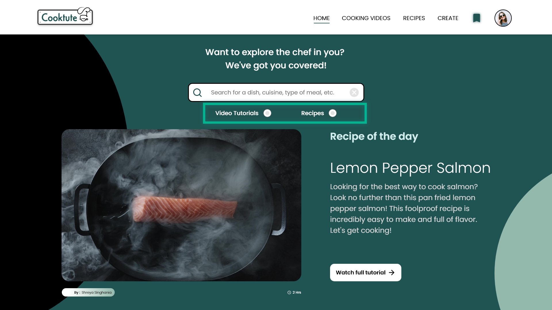
I changed the buttons under the search bar to radio buttons in order to help users set a filter for video tutorials only and exclude recipes with just photos and preparation instructions.
I added an ‘Add to Favorites’ button so that the users can save the tutorials and access them later from the favorites page.
Mockups - Screen Size Variation
I included considerations for additional screen sizes in my mockups based on my earlier wireframes. Because users would like to watch cooking tutorials from a variety of devices, I felt it was important to optimize the browsing experience for a range of device sizes, such as mobile and tablet so users have the smoothest experience possible.
High-Fidelity Prototype
My hi-fi prototype followed the same user flow as the lo-fi prototype, and included the design changes made after the usability study, as well as several changes suggested by my friends who tested the prototype.
Play Video
Click below to view Cooktute’s Hi-Fidelity Prototype
I used appropriate colors throughout the site by maintaining good contrast ratio so that the text is clearly visible.
I used landmarks to help users navigate the site, including users who rely on assistive technologies.
I used headings correctly to organize the structure of the website content.
I used appropriate colors throughout the site by maintaining good contrast ratio so that the text is clearly visible.
I used landmarks to help users navigate the site, including users who rely on assistive technologies.
I used headings correctly to organize the structure of the website content.
FUTURE ROADMAP
Takeaways
Impact
Our target users shared that the Cooktute website was effortless to navigate through, demonstrated a clear visual hierarchy and it was engaging and fun as the visual design was aesthetically pleasing.
What I learned
I learned that what might see easy for me while designing a user flow might not be the same for other users, therefore thorough testing and iteration will help the design get better in all the aspects, be it interaction or visual.
Next Steps
Conduct follow-up usability test on the new website
Identify any additional areas of need and ideate on new features